UX & UI ﹡ MOTION GRAPHICS
Boosting an online presence to empower and support women in mastering their craft
Shine Bootcamp
Client
Shine Bootcamp is an accelerator for women seeking to enhance their communication skills and establish themselves as esteemed speakers in their respective fields.
Through Shine's programs, participants can hone their speaking abilities, shape impactful narratives, and deliver captivating presentations with confidence.
Timeline
January - February 2021
✦ OVERVIEW
Problem
Shine Bootcamp needs to solidify its brand identity throughout its online platforms to boost sales for its upcoming programs.
Outcome
Boosted social media outreach through motion piece.
Improved accessibility and simplified user flow in the main conference site.
Team Formula 6 was the selected winning team by the client, Shine Bootcamp.
Team Formula 6 obtained the VFS Award for Best Team Project.
✦ MY ROLE
UX & UI, Motion Graphics
This collaborative project involved redesigning a website, creating a motion piece, and increasing Shine Bootcamp's overall online presence to boost ticket sales for their upcoming conferences.
The team for this project was called Formula 6, consisting of six members split evenly into three interactive designers and three motion designers. Feedback and support were provided to all team members.
Since this project's scope turned out to be significant, we decided to split the teams into the specialization of their choice. I mainly focused on the UX/UI redesign of the website but also added a small contribution to the final promotional motion piece.
✦ UNDERSTANDING THE PROBLEM
Identifying initial challenges
Some of the problems we encountered were:
The current website is not engaging enough for conference organizers.
There is no easy way to find speakers on the speaker gallery.
Subscribe button doesn't provide information of what users would get if they write their email down.
No clear connection between the main site and the conference site (no clear way to go from one site to the other).
Confusing visual layout on the conference site.
It's hard for organizers/learners to get to the conference website as there is no proper flow to get to it.
Scope and direction
By analyzing the current sitemap and its features, we had a clear idea of the scope of this project, which allowed us to make adequate suggestions for the redesign given the time we had to complete it.
For the UX & UI designers, our main area of focus was the Homepage. However, we also redesigned the Speakers page to improve visibility and consistency and keep users informed about what is going on through appropriate feedback.
Our scope consisted of simplifying the user experience across all website pages and solidifying the brand identity. This redesign had to be consistent with the promotional motion piece.
✦ THE PROCESS
Defining the goals
Increase Shine Bootcamp's online presence and boost ticket sales for their upcoming conference.
Redesign their current conference website (desktop and mobile).
Create a 30-second promotional motion piece.
✦ FINDINGS
User Journey
For the website redesign, we approached this problem by running a thorough heuristics evaluation for the current Shine Bootcamp Conference website. We wanted to figure out the ways in which they currently obtained their main traffic to their sites, which is actually through their social media platforms, specifically Instagram.
Personas
Firstly, it was important to identify the problem and areas of opportunity as well as the target audience.
For their target audience, there were three personas:
Conference Organizers
Friends and Family
Learners

Branding
The interactive team had to redesign taking into consideration user needs and business goals, while preserving the overall brand essence that Shine Bootcamp aims to convey to their target audience. However, we decided to tweak the branding just a bit in order to create a fresh perspective without going off brand.
8
iterations
4
user tests
tons
of meetings
100+
cups of coffee
✦ HOW DID I
Make sure users would explore the entire homepage?
The home page was crucial because it was the starting point for the user to decide whether to join the conference by purchasing tickets or not. We decided to make the hero section enticing enough to reveal videoclips from past events and create a more immersive atmosphere that would invite the user to keep scrolling through the home page and to explore the entire site.
Make sure users would get more information about the event?
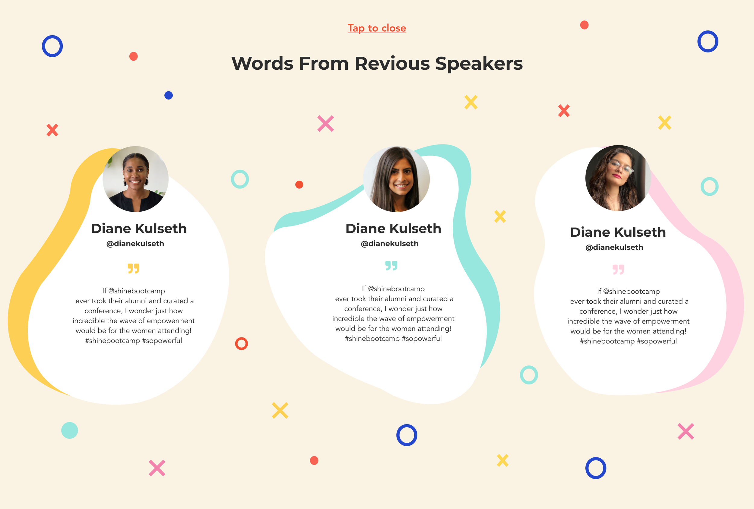
It was important to let the user know all about Shine Bootcamp Conference. Since the main traffic to the site comes from social media pages, we imagined that visitors would have a level of familiarity with the organization Shine Bootcamp but it was also important to let all target audiences know the information needed to make a faster decision to get tickets for the conference.
By adding short paragraphs below the hero section, we were able to include a short but very informative description about the event in terms of speakers, topics, and types of attendees.
Takeaways ➶
-
Working alongside very talented individuals ensured that many points of view were considered in every design decision. Each of us took advantage of our meetings to collaborate and provide constructive feedback, creating a pleasant result.
As a designer, it is essential to express your ideas and hear other people’s perspectives to ensure that the design finds common ground for all. Working on collaborative projects hones your abilities as a designer, enabling you to solve problems more innovatively and robustly. -
Although constant communication with the client might sound overwhelming, all stakeholders must stay up-to-date with all design decisions at every step of the process.
Constant communication and feedback cut back time at a later stage in the process and ensured that all stakeholders were happy with the final design.